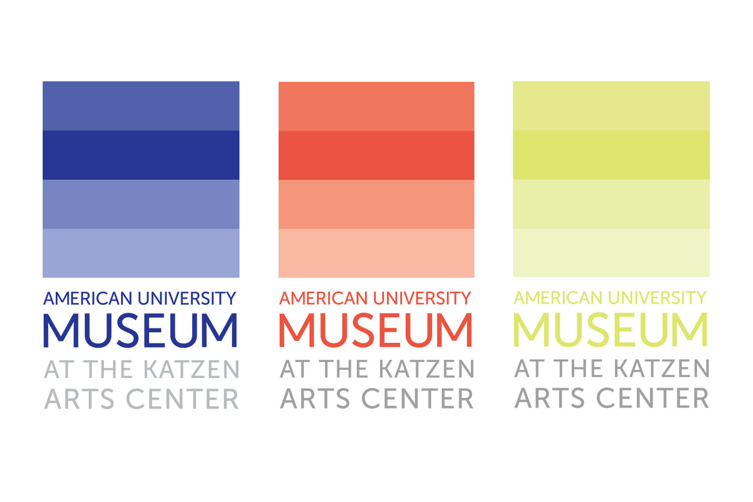
American University Museum
Getting on a museum’s level
About this project
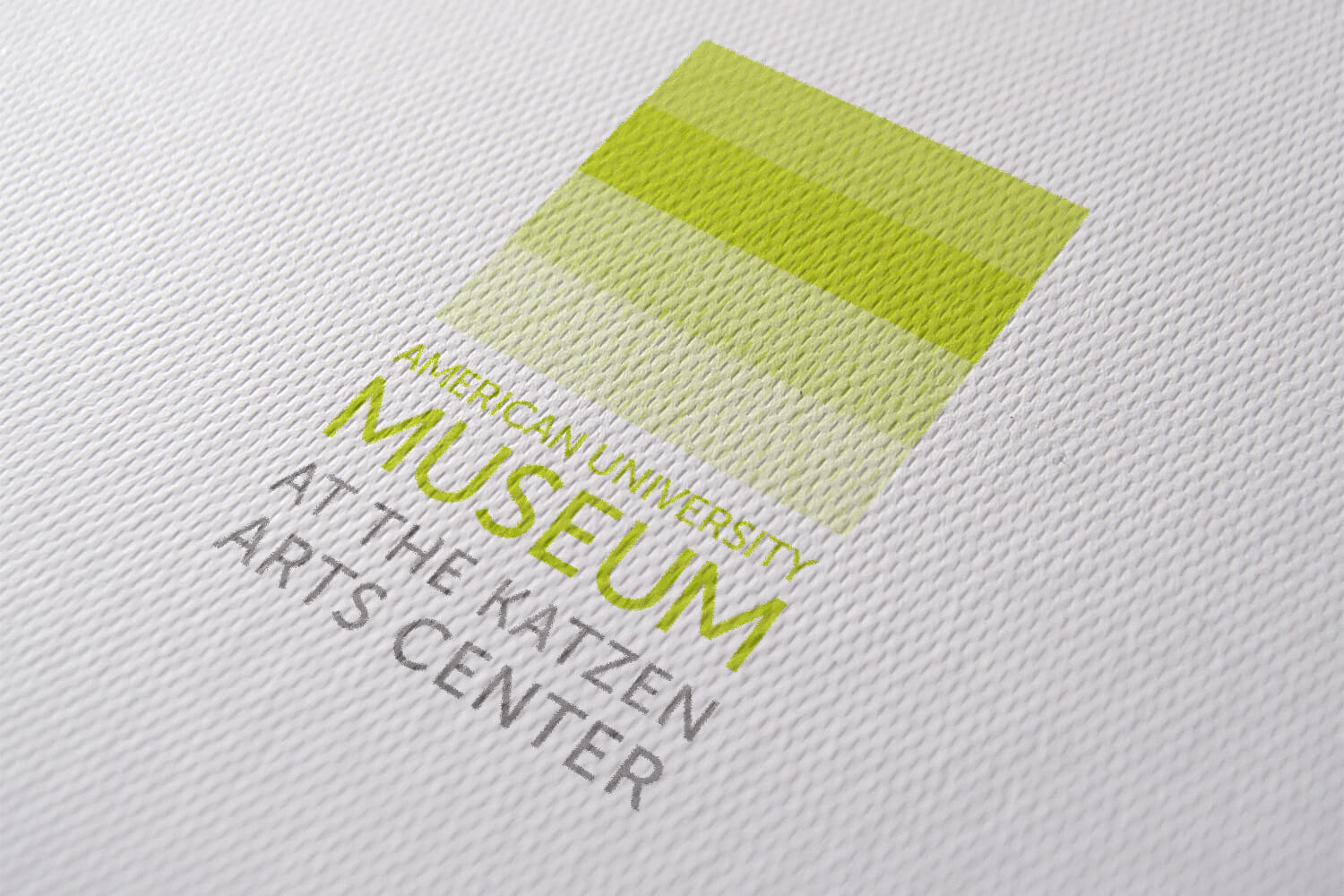
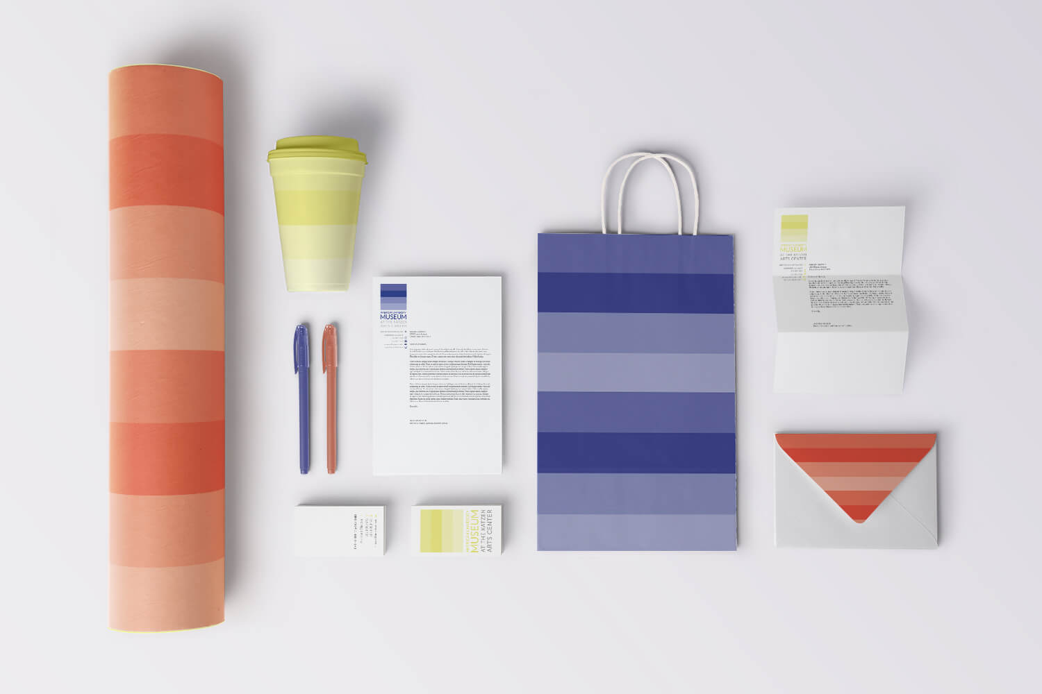
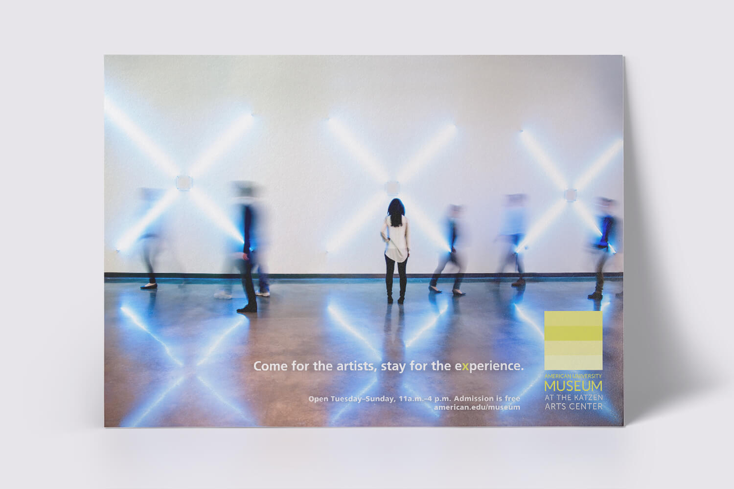
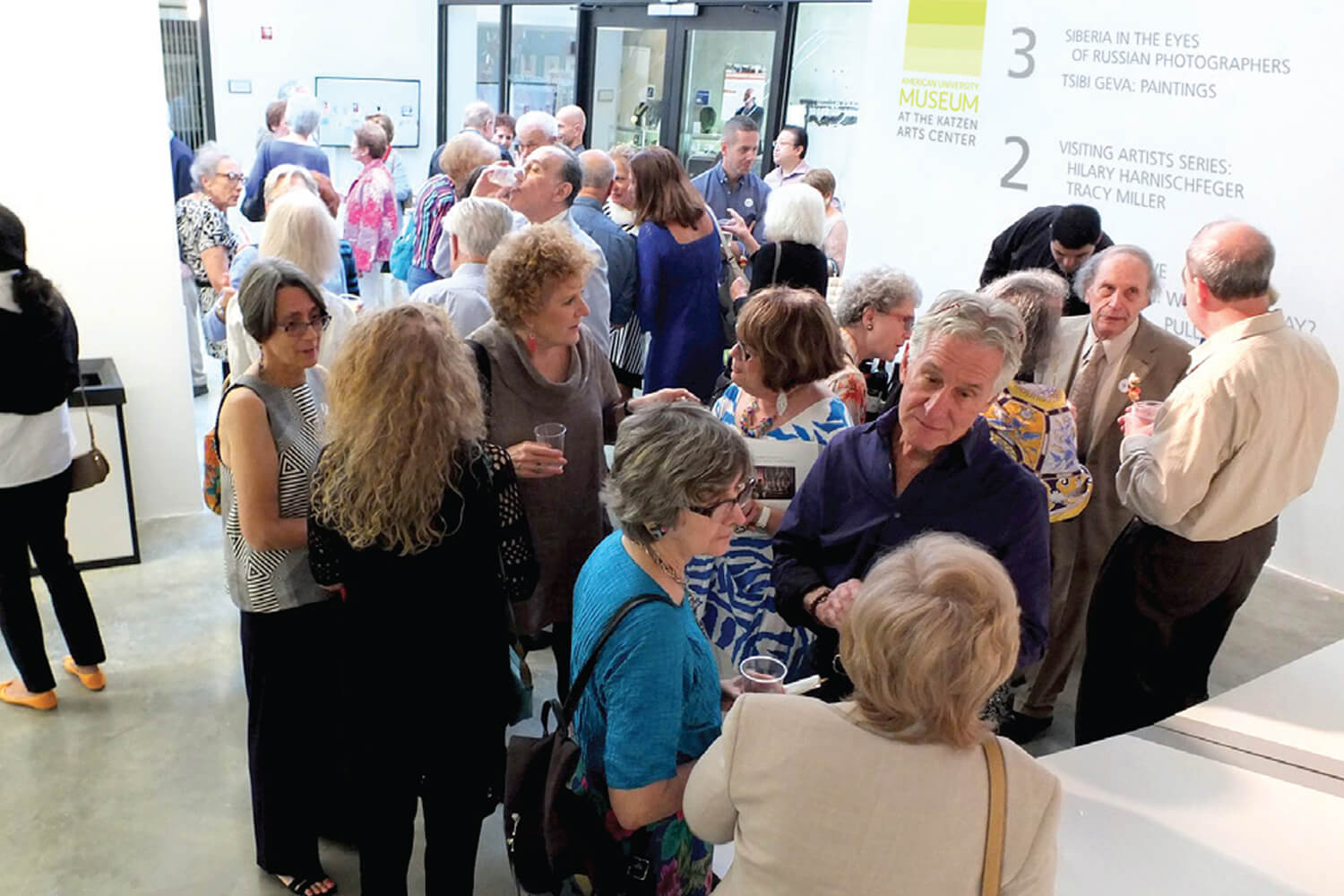
The AU Museum was looking for an updated identity that established it as a respected contemporary museum of the DC area. I concepted a striped mark in three saturated, lively colors. The stripes had a dual purpose—both visual interest as well as directional use. The four stripes reference the four physical levels of exhibitions in the museum, each color being used for signage of that level. Using three colors for the mark referenced the three main exhibition seasons, separating each visually in signage and copy. These bright stripes formed a background for other collateral, including envelopes, gift bags, poster tubes, and stationary. The shift to this identity was welcomed, enabling the museum to appeal to a broader audience, even the college students on campus.
Art Direction: Katherine MacDiarmid
Services: Brand Strategy, Branding, Packaging Design, Advertising
